A New System for
Home Health
Adaptive is building an AI-native operating system for home health, combining technology with real-world care. Slope partnered with Adaptive Innovations to position and launch a brand that could stand apart from traditional healthcare while balancing technical precision with the credibility required by health systems.
In a category defined by familiar conventions, Adaptive takes a different position: care is physical, the bottleneck is administrative, and AI should clear the path so clinicians can focus on patients. The brand needed to feel sharp, decisive, and credible to both health system leaders and the technical teams building the platform.
With 100,000+ patient visits and major Texas health systems already on board, the identity reflects the scale and ambition of what Adaptive is building.
Identity System
Web Design
Motion

Built to Adapt
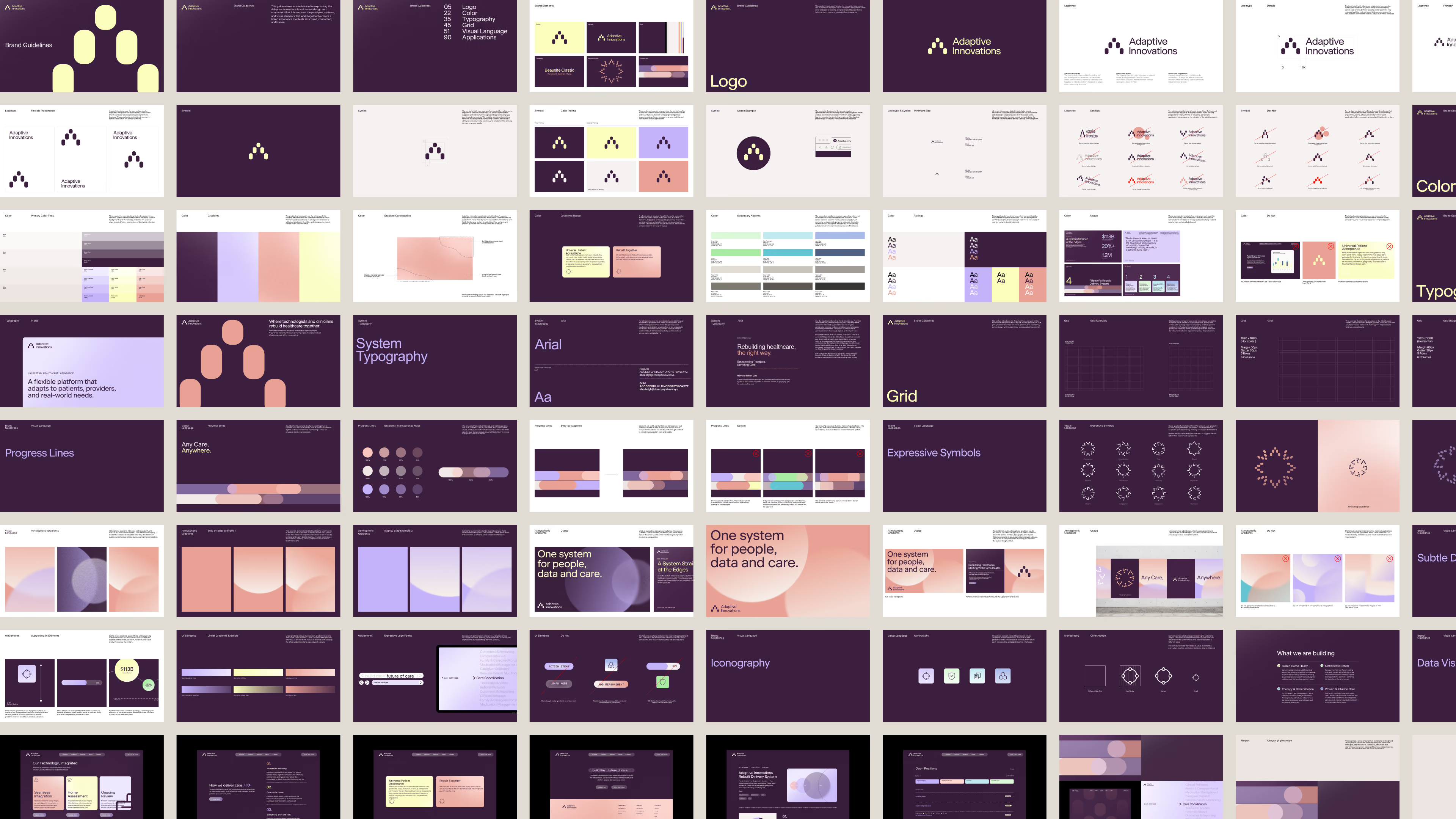
The Adaptive mark is a stylized “A” built as a directional system, with modular forms that progress upward and forward. The stepped geometry creates a clear sense of movement, reflecting a platform designed to continuously adapt, scale, and advance. Together, the forms create a structured visual language centered on progression, momentum, and growth.
Depth & Direction
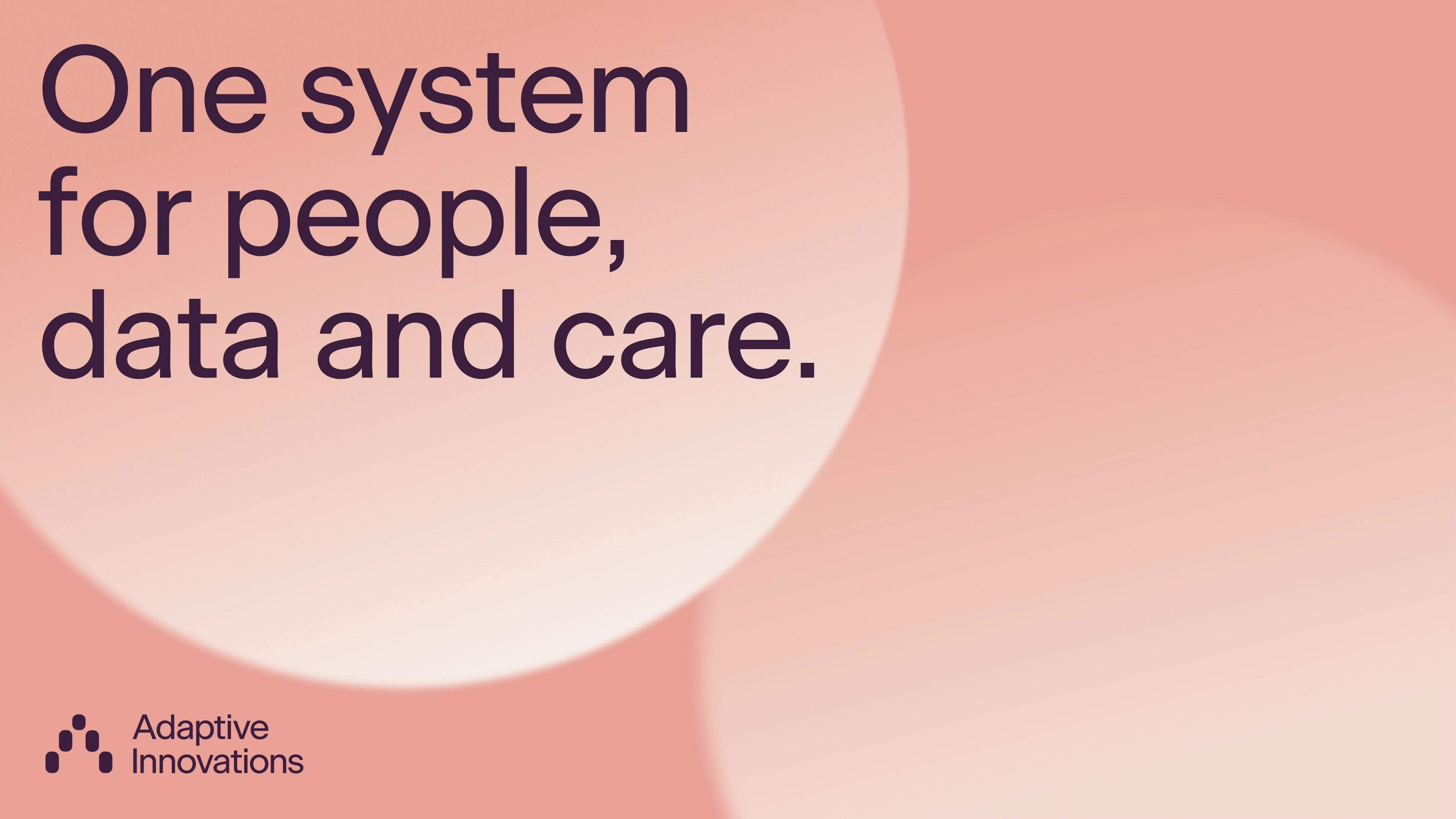
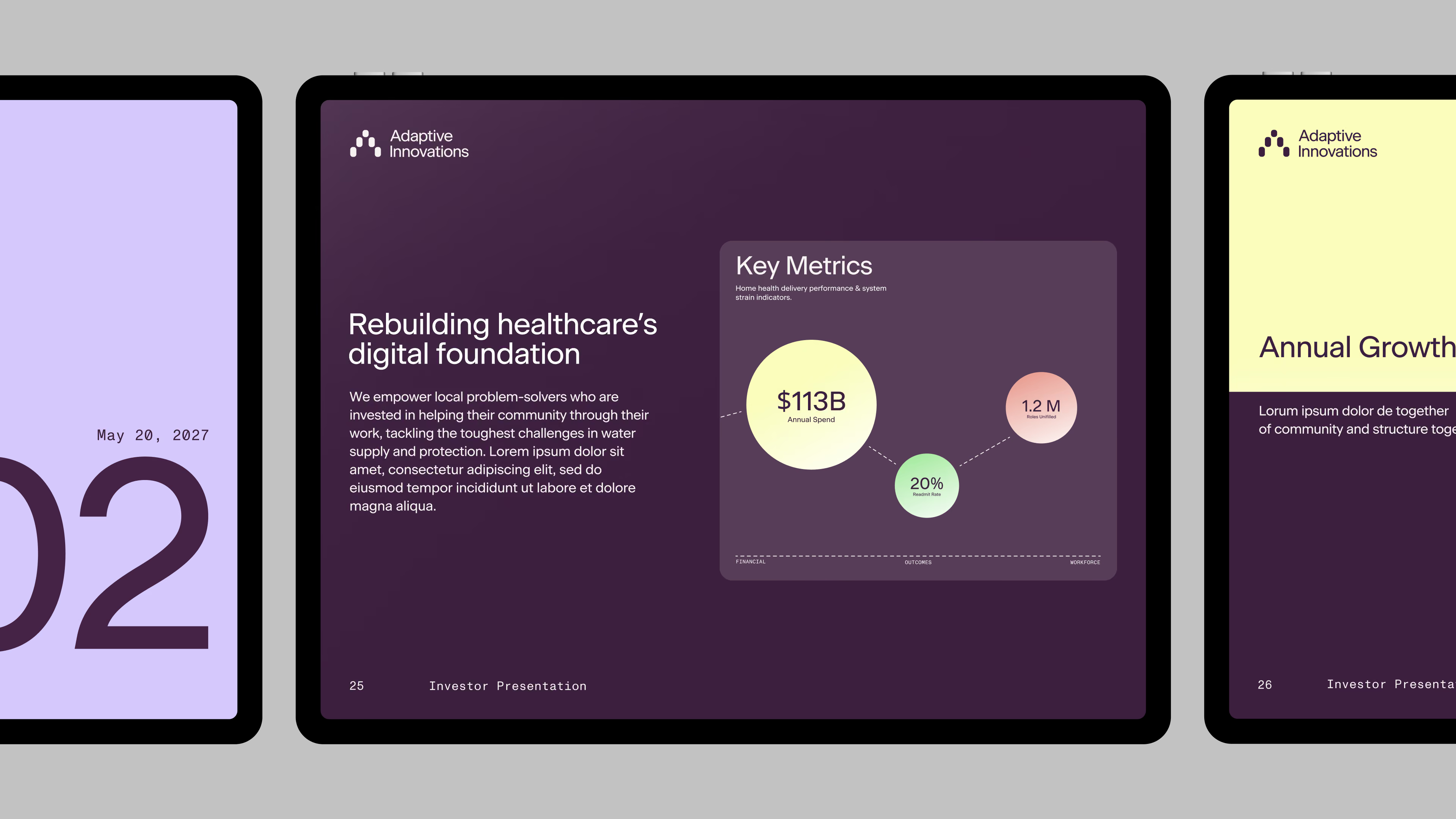
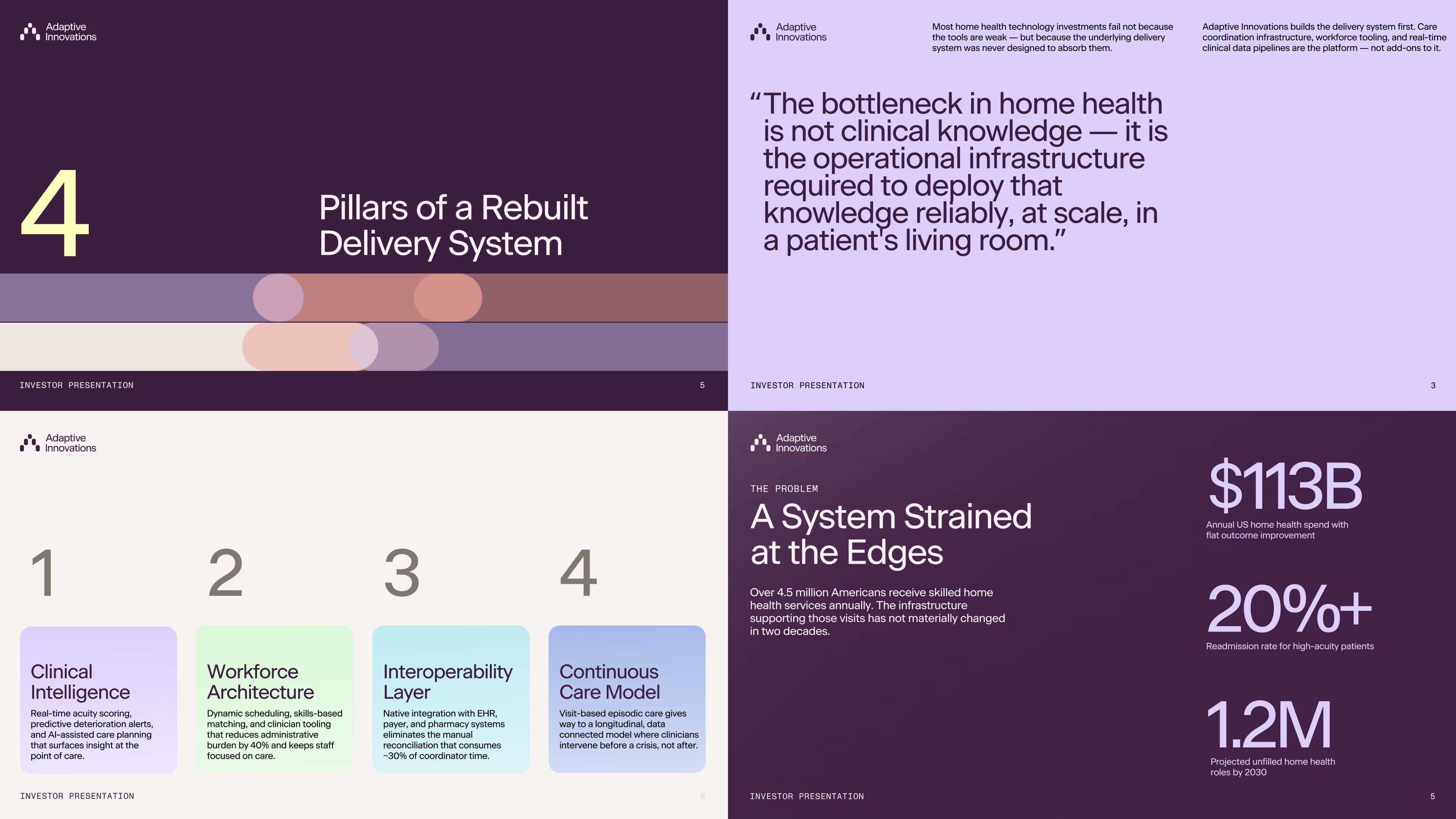
The color system moves away from the clinical palettes commonly found in healthcare, using rich, deep tones to create a more distinctive and dimensional foundation. Deep Plum and cool neutrals bring depth, precision, and confidence, while softer accents introduce warmth and approachability.
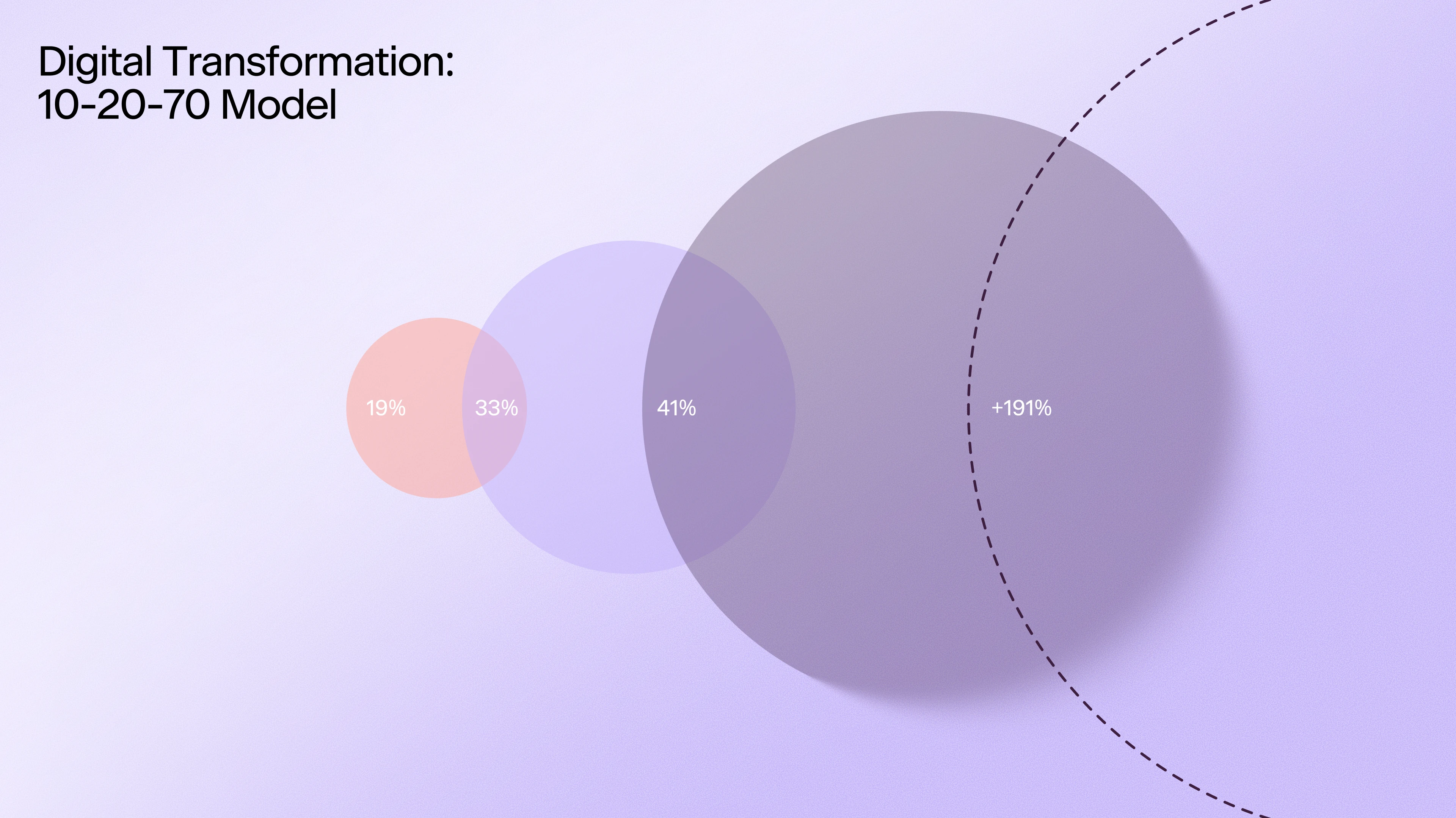
Gradients extend the palette with added dimension and flexibility, while secondary colors support data visualization, UI, and supporting graphics without competing with the core brand.
From Symbol to System
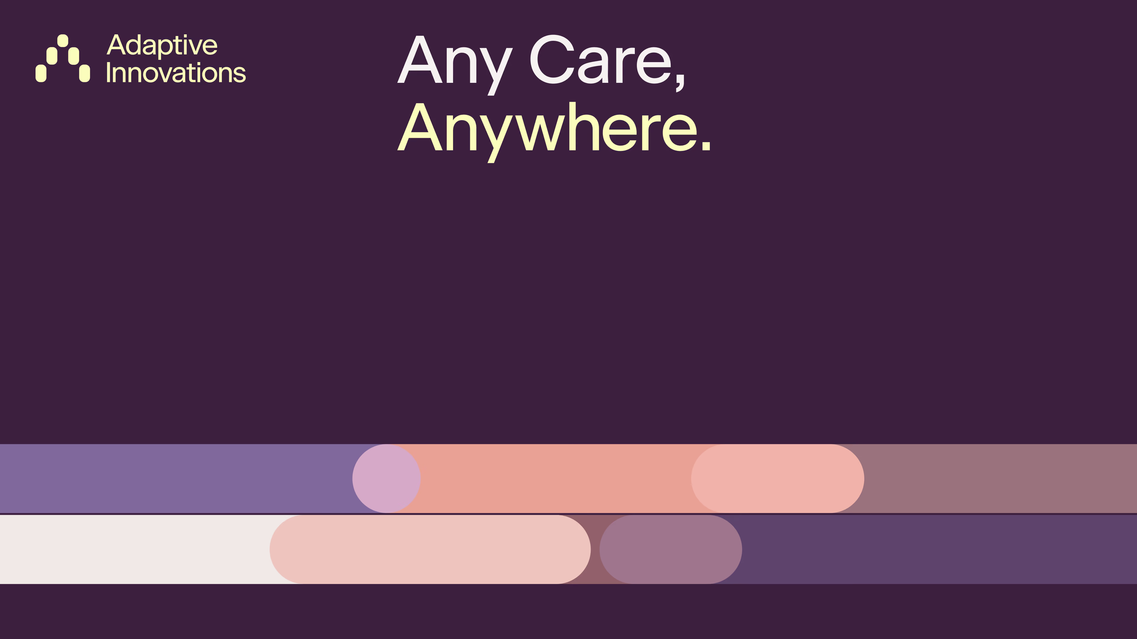
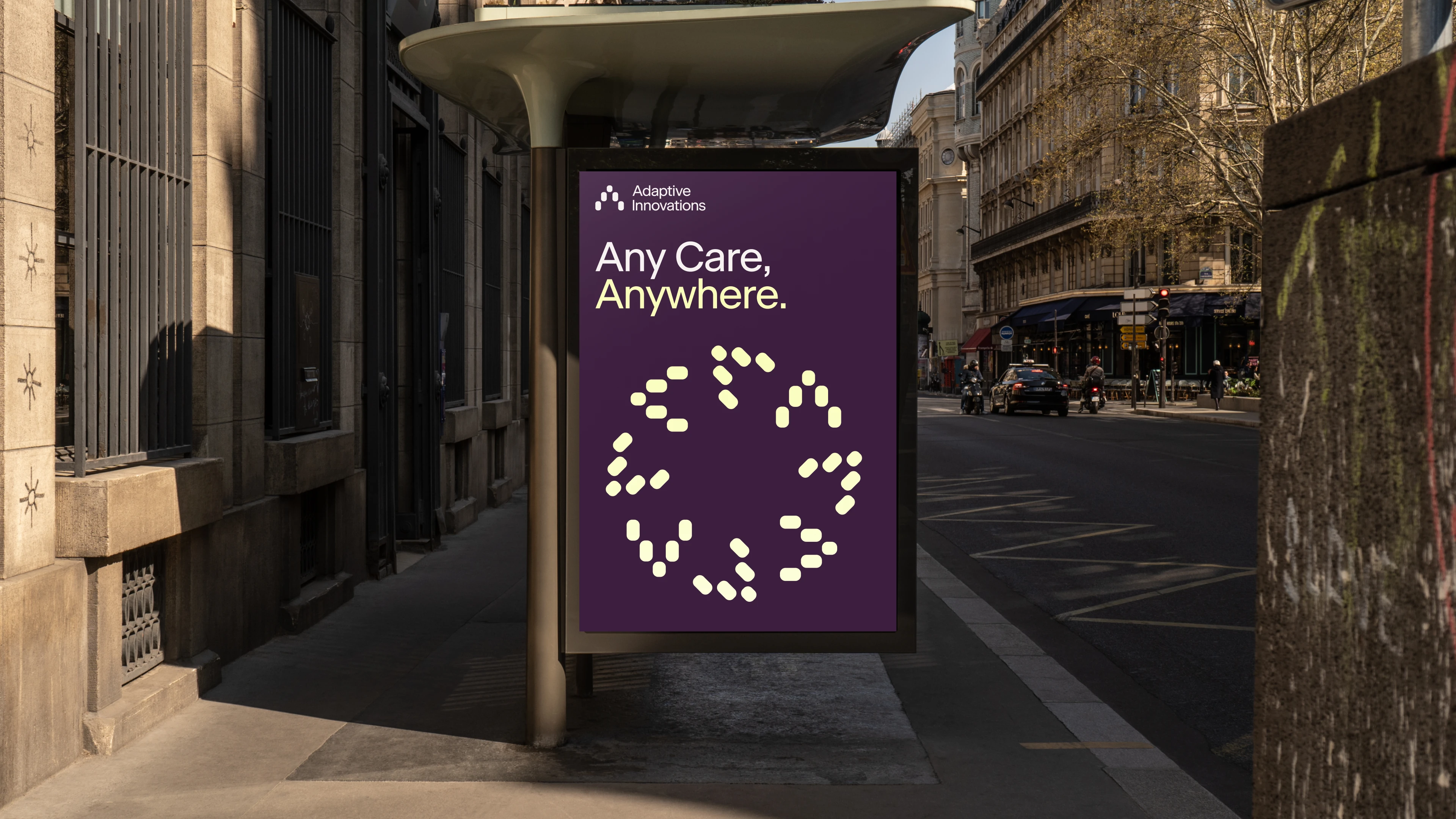
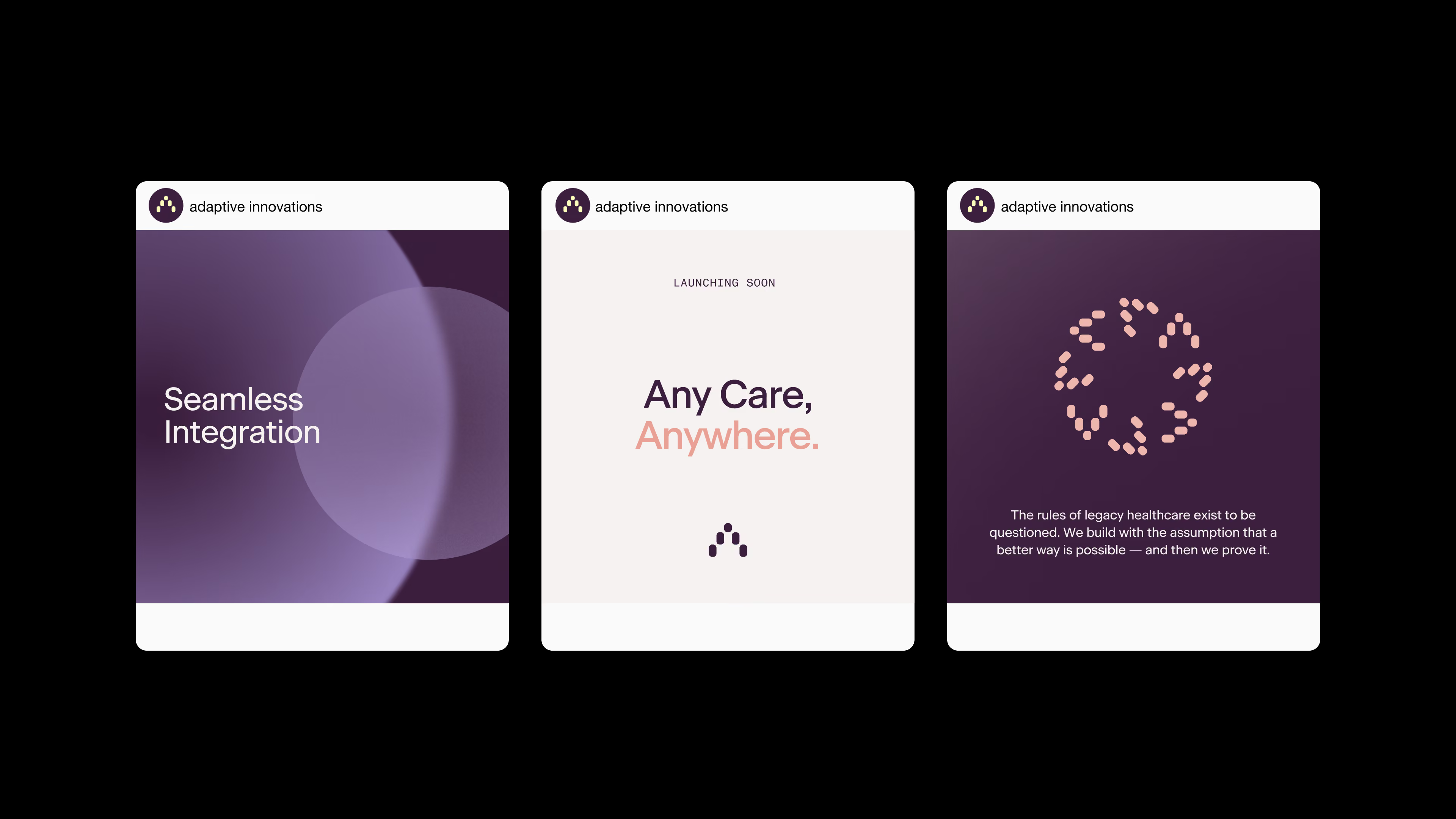
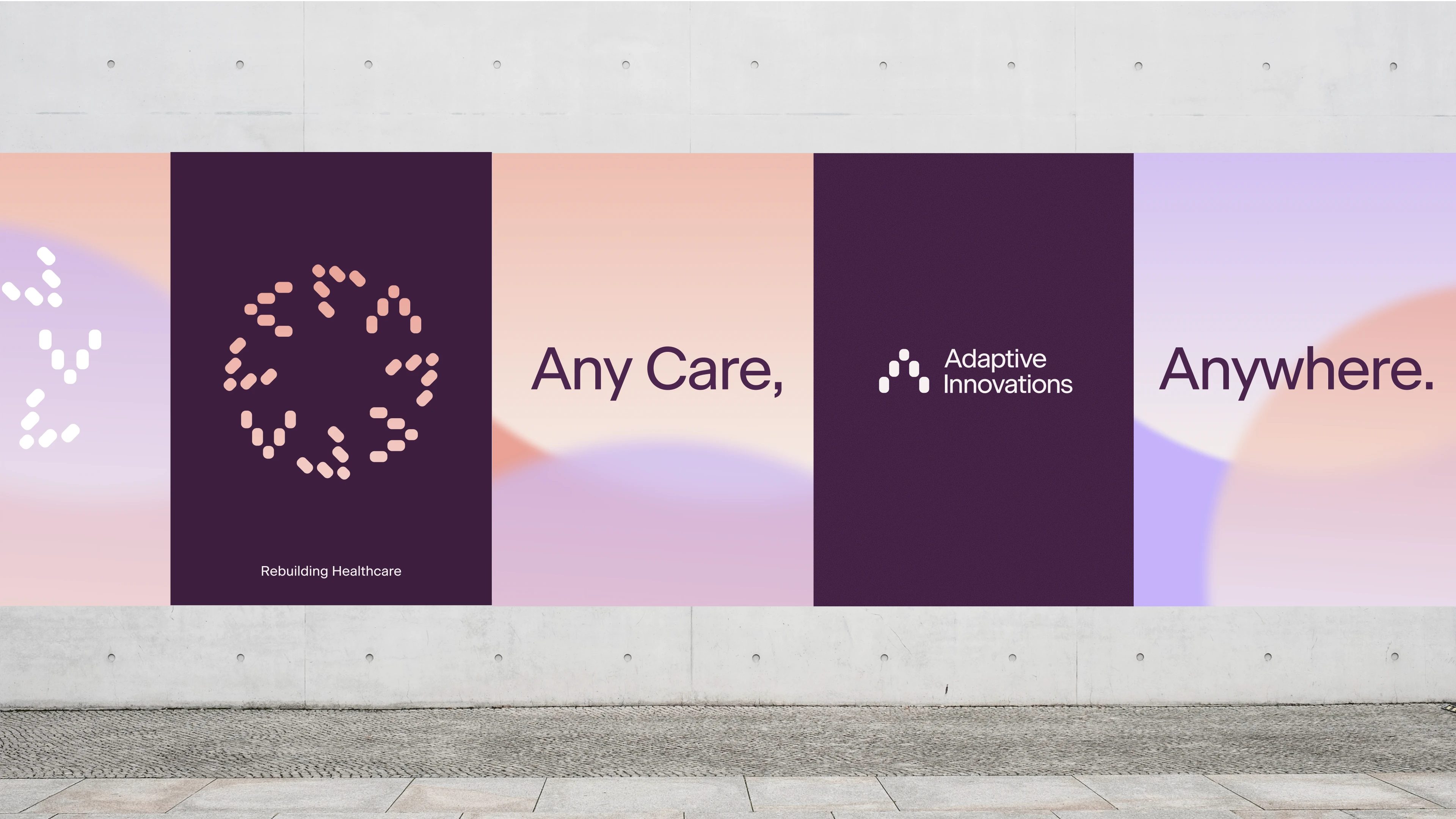
The symbol extends into a modular shape language built from the same core geometry. By rearranging and recombining these forms, the system creates a flexible set of graphic elements that can be used across brand, product, and communication.
The shared construction keeps each variation connected to the Adaptive identity while allowing the system to shift in scale, composition, and expression.

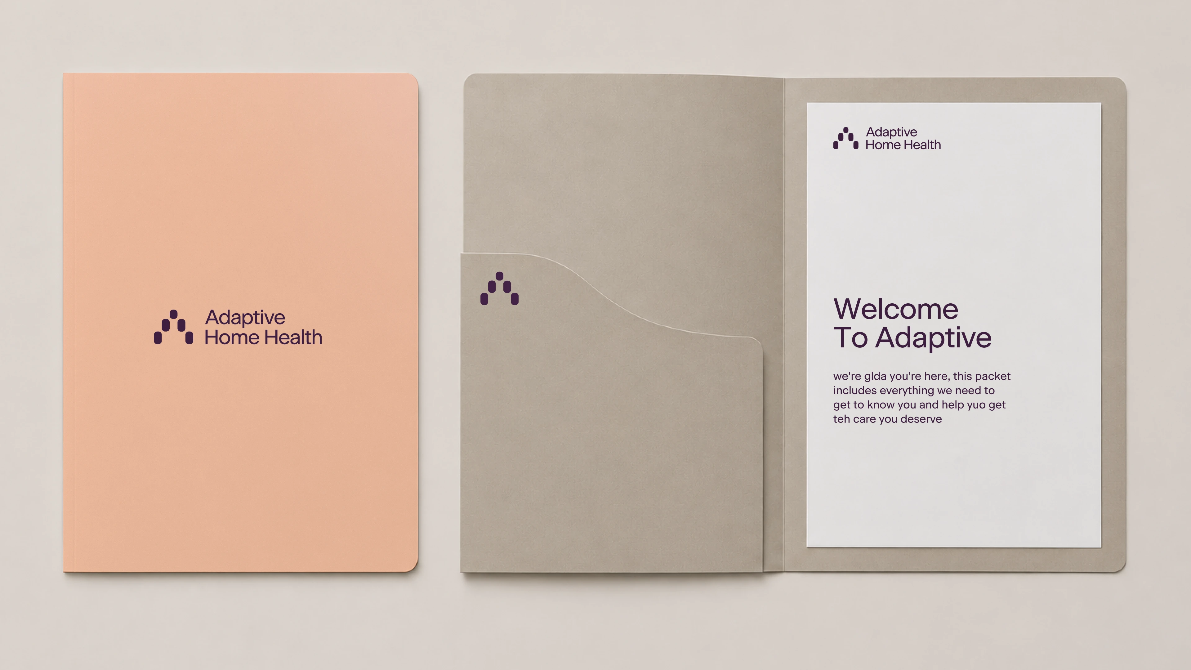
Adaptive Home Health
Adaptive Home Health is the patient-first, customer-facing expression of the brand. It uses the same core identity system and lockup structure, while shifting the visual emphasis to feel more approachable and directly connected to the care experience.
The palette expands with additional tonal ranges while staying within the same warm overall system. Adjusting the proportions of these colors helps Home Health feel distinct from the core platform while remaining clearly part of the Adaptive brand.