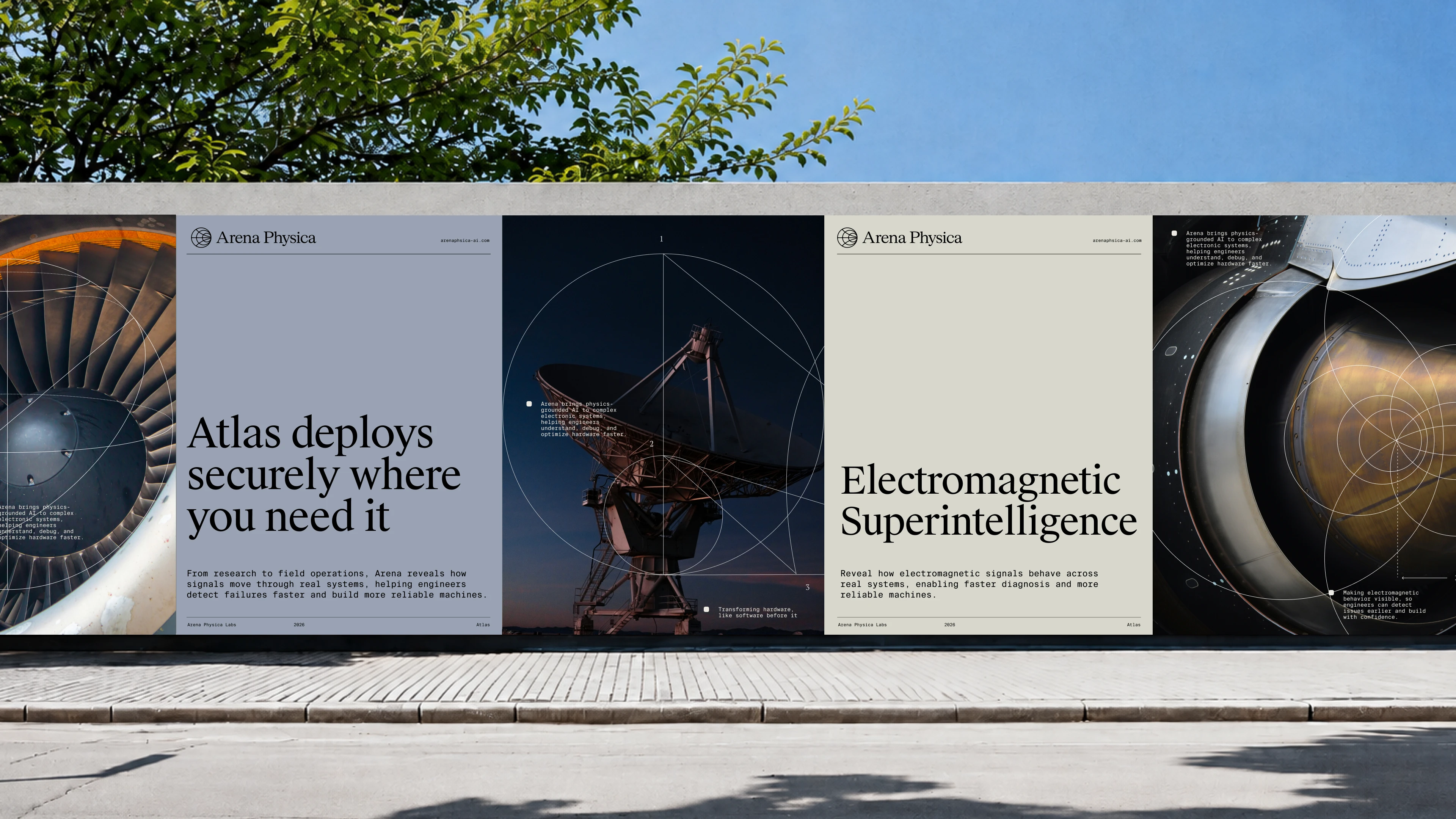
Electromagnetic Superintelligence
Arena Physica is building a new foundation for how complex hardware gets designed, tested, and understood. Its AI-powered platform, Atlas, connects fragmented engineering data across disciplines, turning complexity into clarity and helping teams move from problem to solution faster.
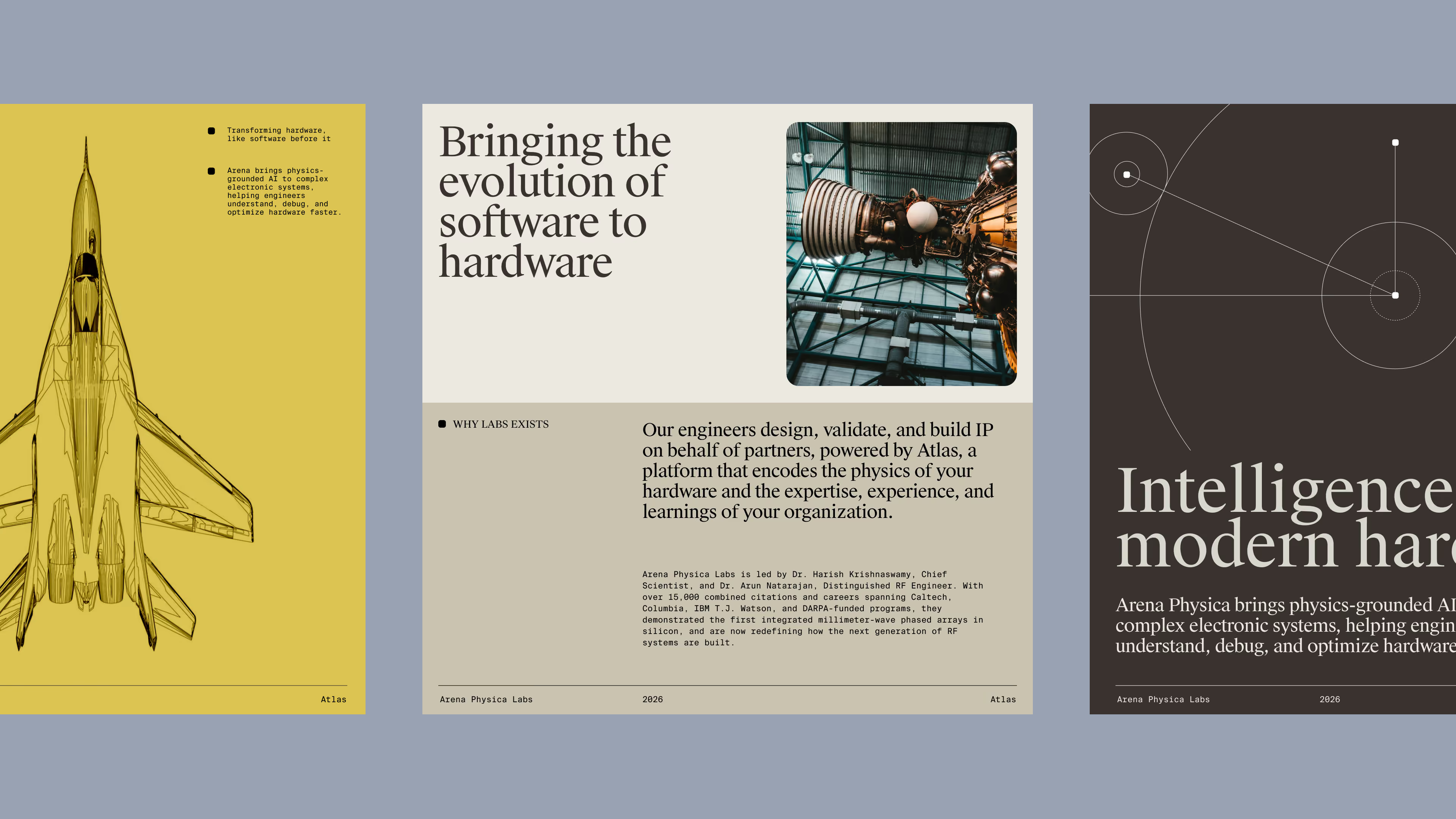
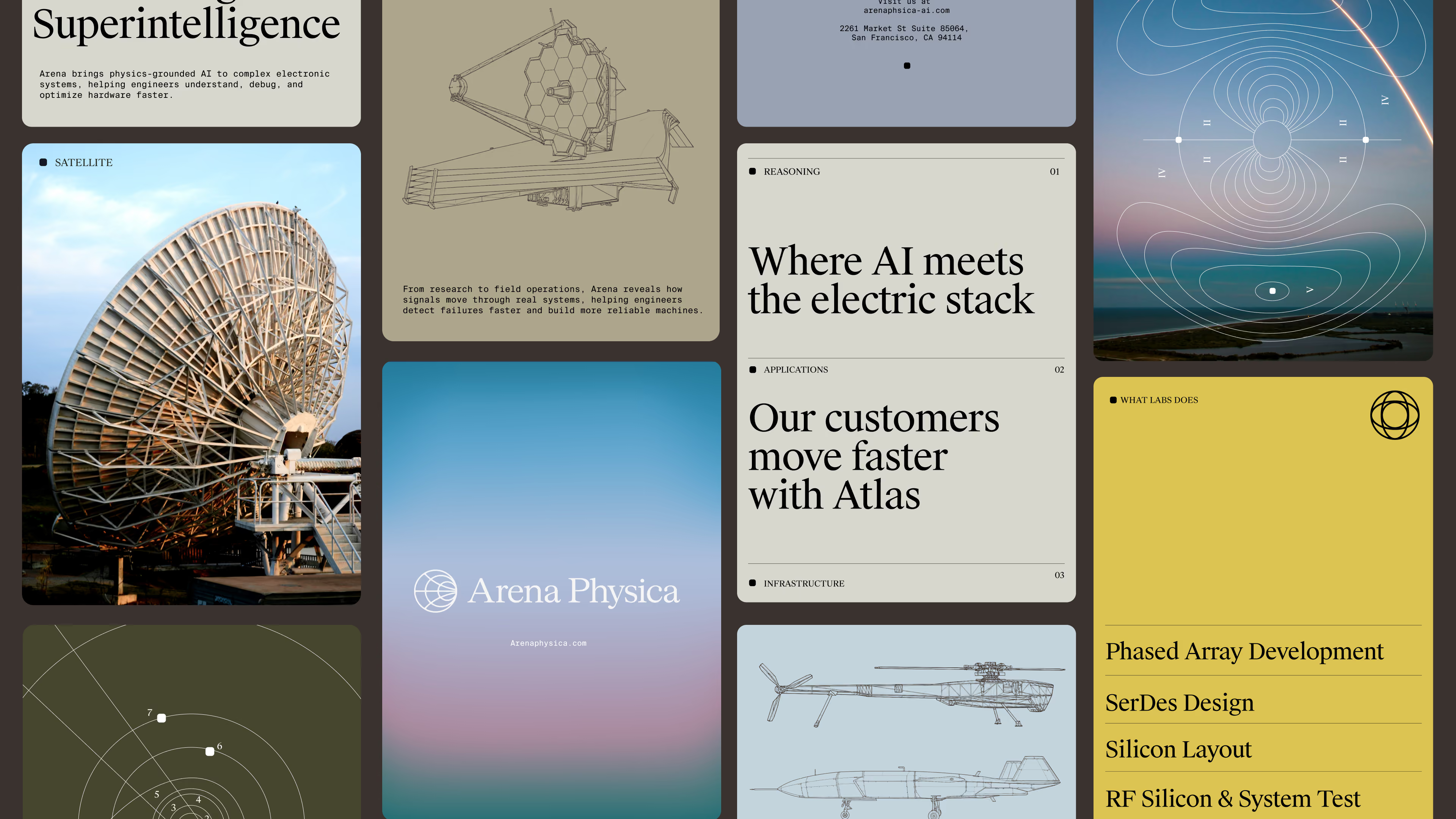
We built the brand system around that same idea: bringing structure to complexity. The identity balances the precision of engineering with a more progressive, expressive point of view, creating a flexible visual language that feels technical without being rigid and forward-looking without losing credibility.
Web Design
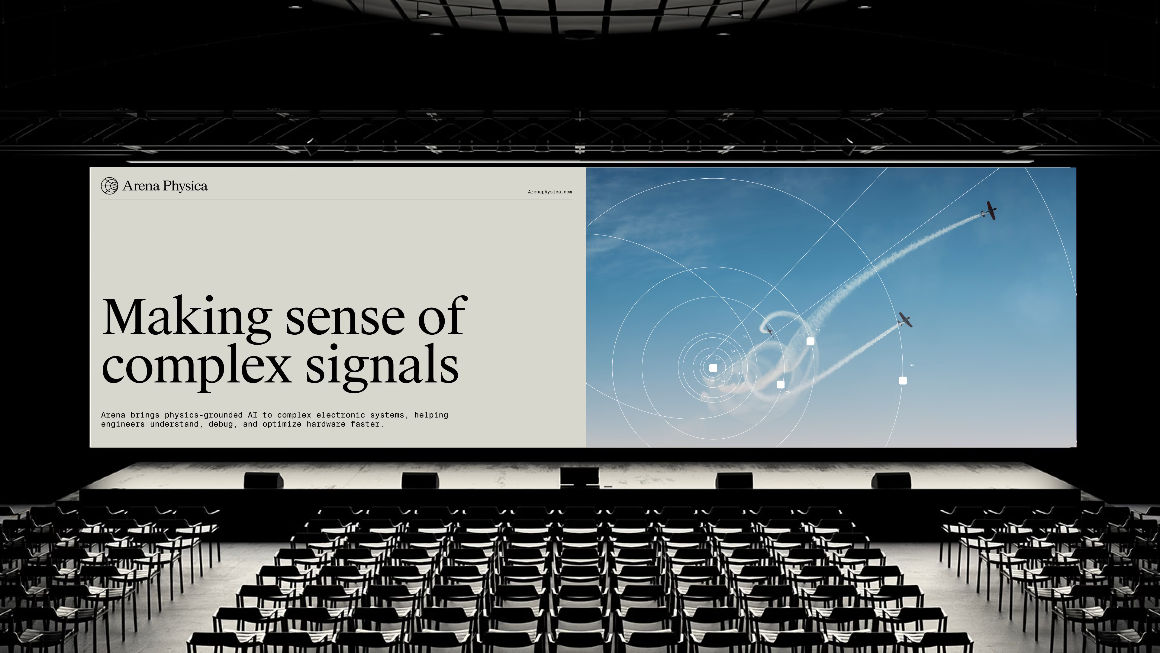
Motion
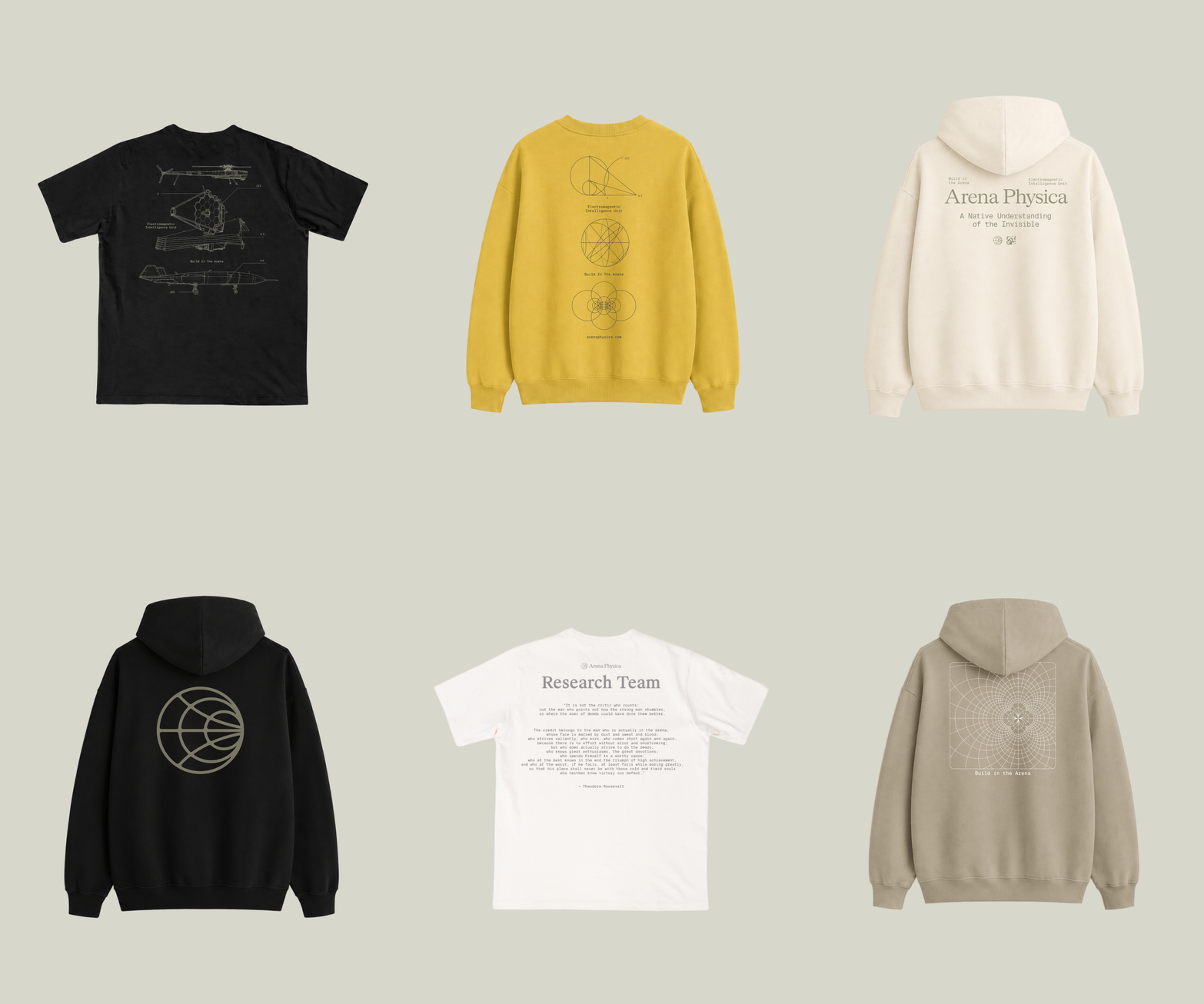
Merch Design
date from Founders Fund and
Initialized Capital
Drawn from Data
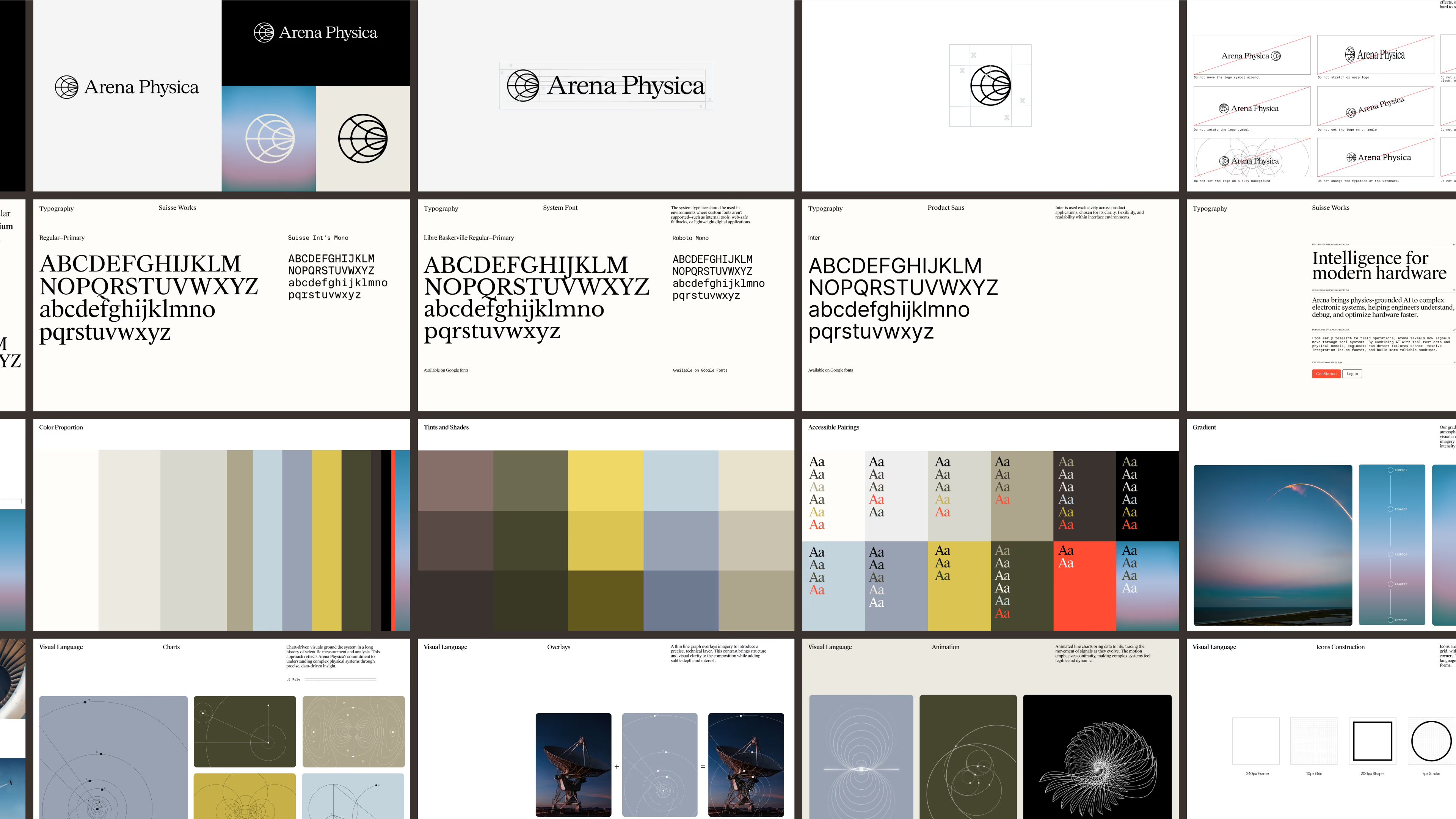
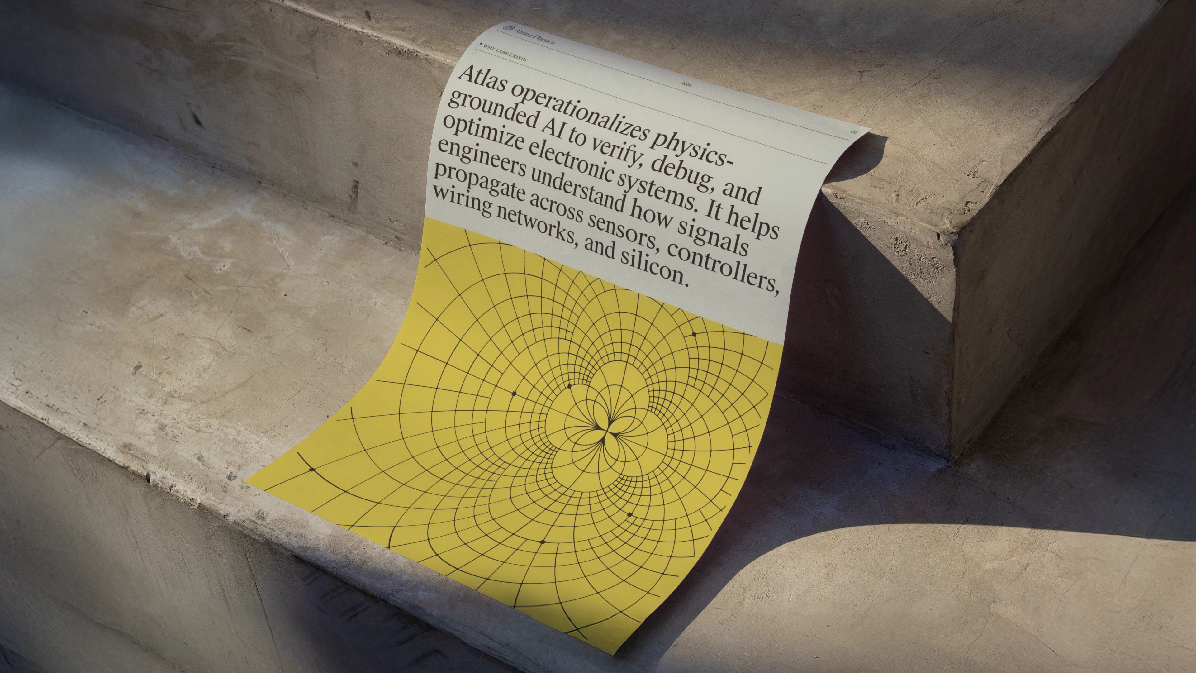
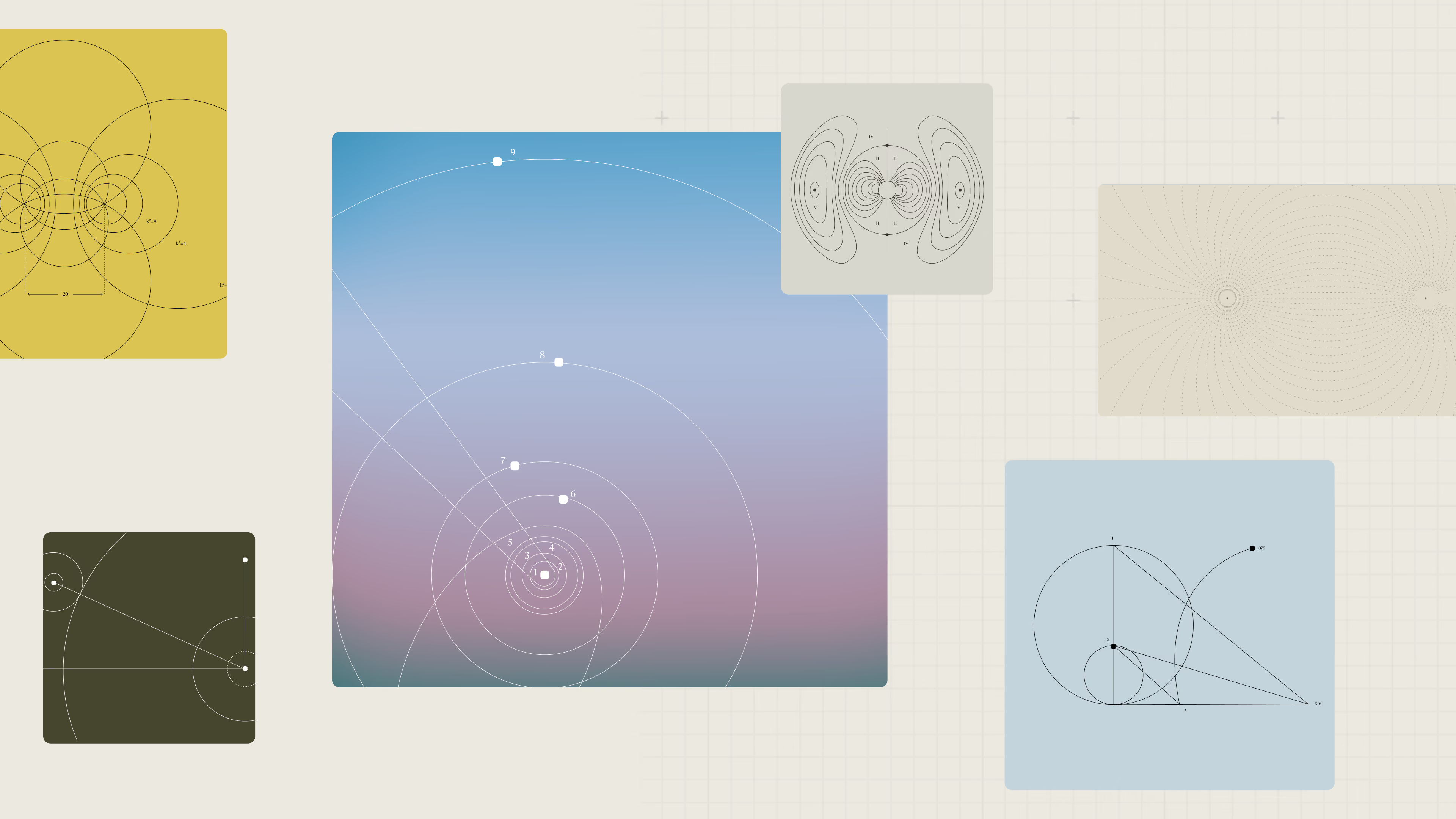
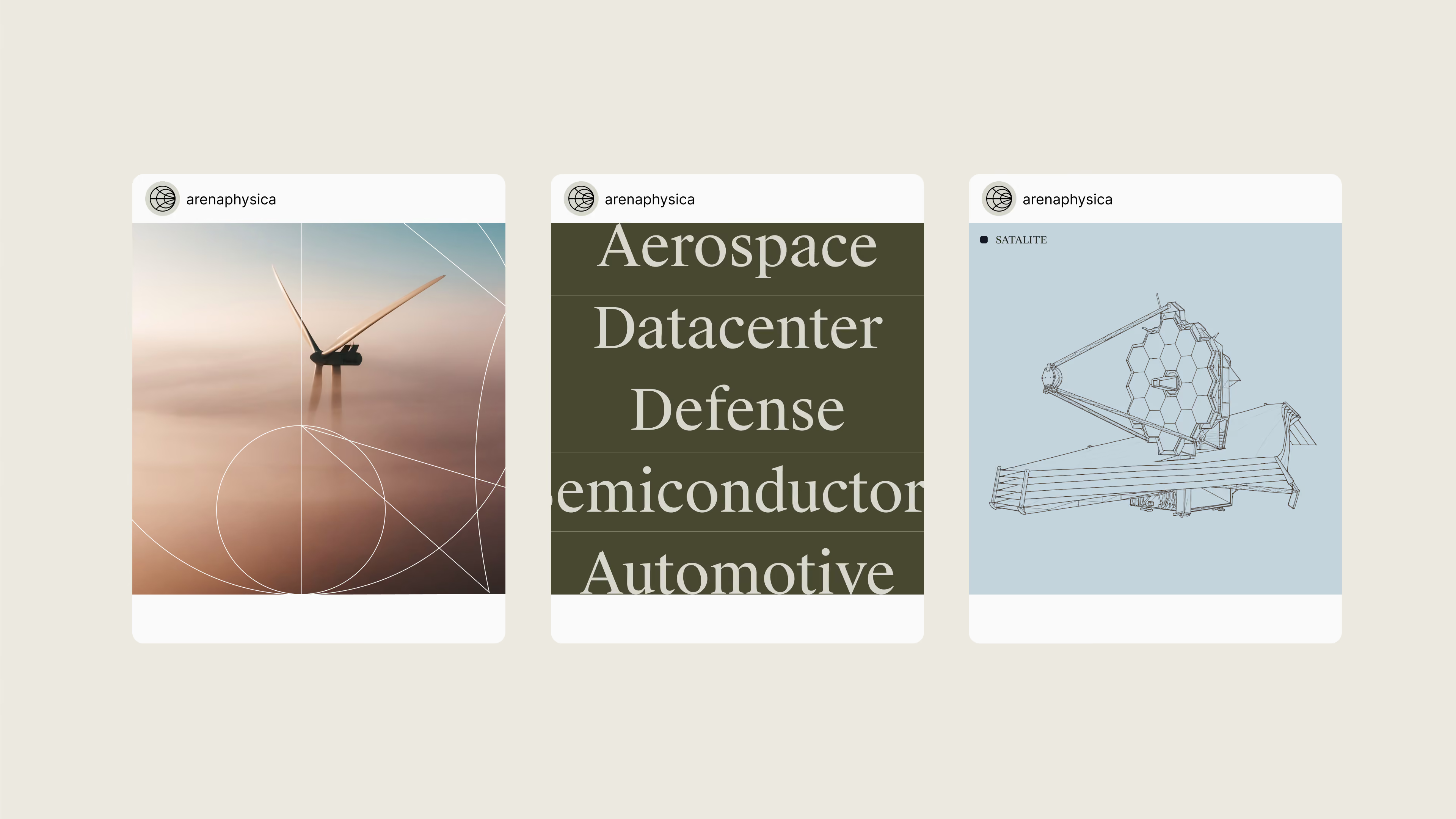
Technical chart line illustrations ground the visual system in the language of engineering, measurement, and analysis. Inspired by the diagrams and plotting methods engineers use to understand complex physical systems, these precise line-based graphics bring a sense of rigor and intelligence to the brand while remaining flexible enough to work as both functional and expressive visual elements.
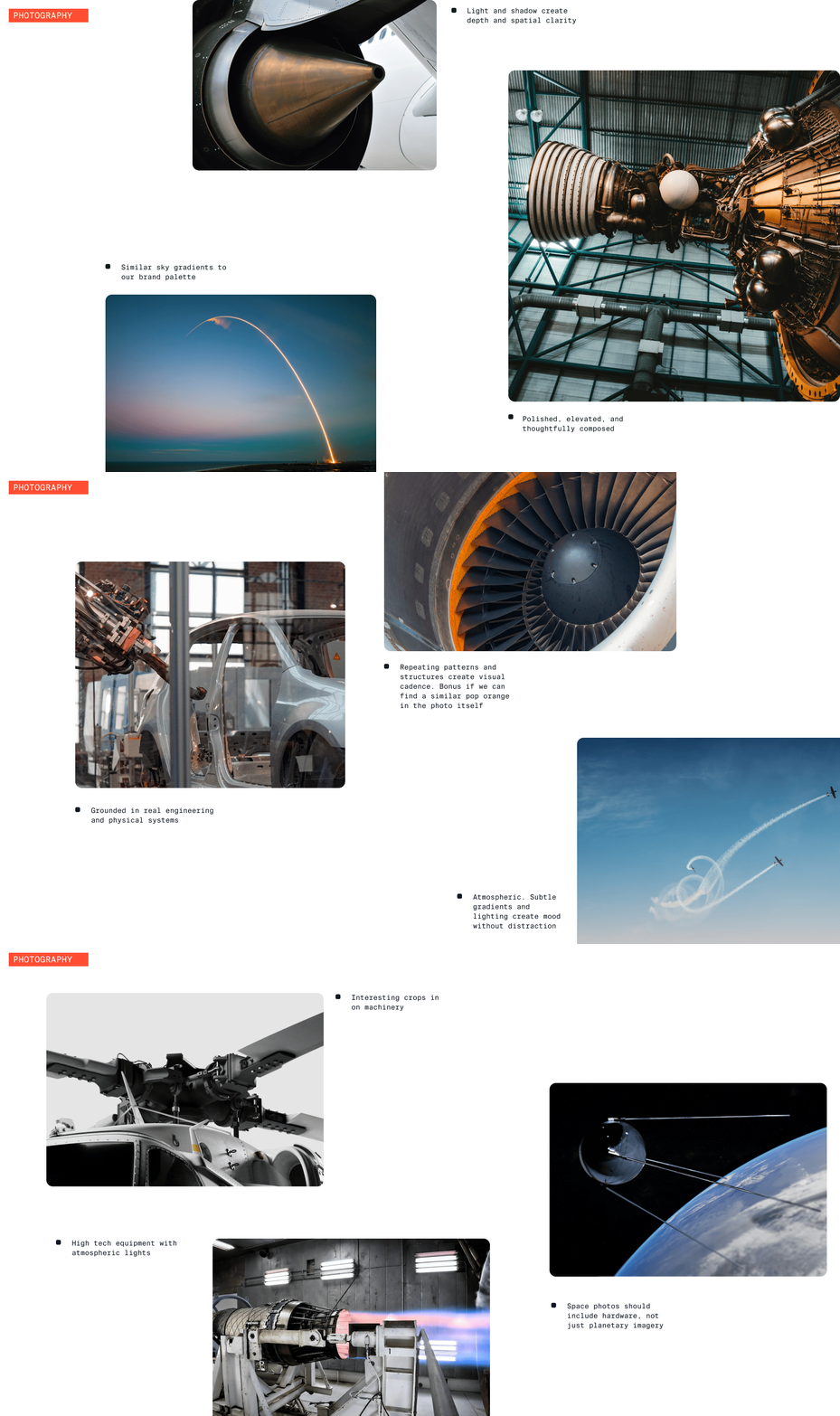
Built from Engineering
The Arena Physica mark is built around a simplified interpretation of the Smith chart, a foundational diagram used to visualize and understand complex electrical systems. Its circular geometry and intersecting paths distill that technical language into a clear, ownable symbol. The result reflects Arena Physica’s role in bringing complex engineering data together, revealing relationships across systems, and turning complexity into something more understandable and actionable.
Editorial Contrast
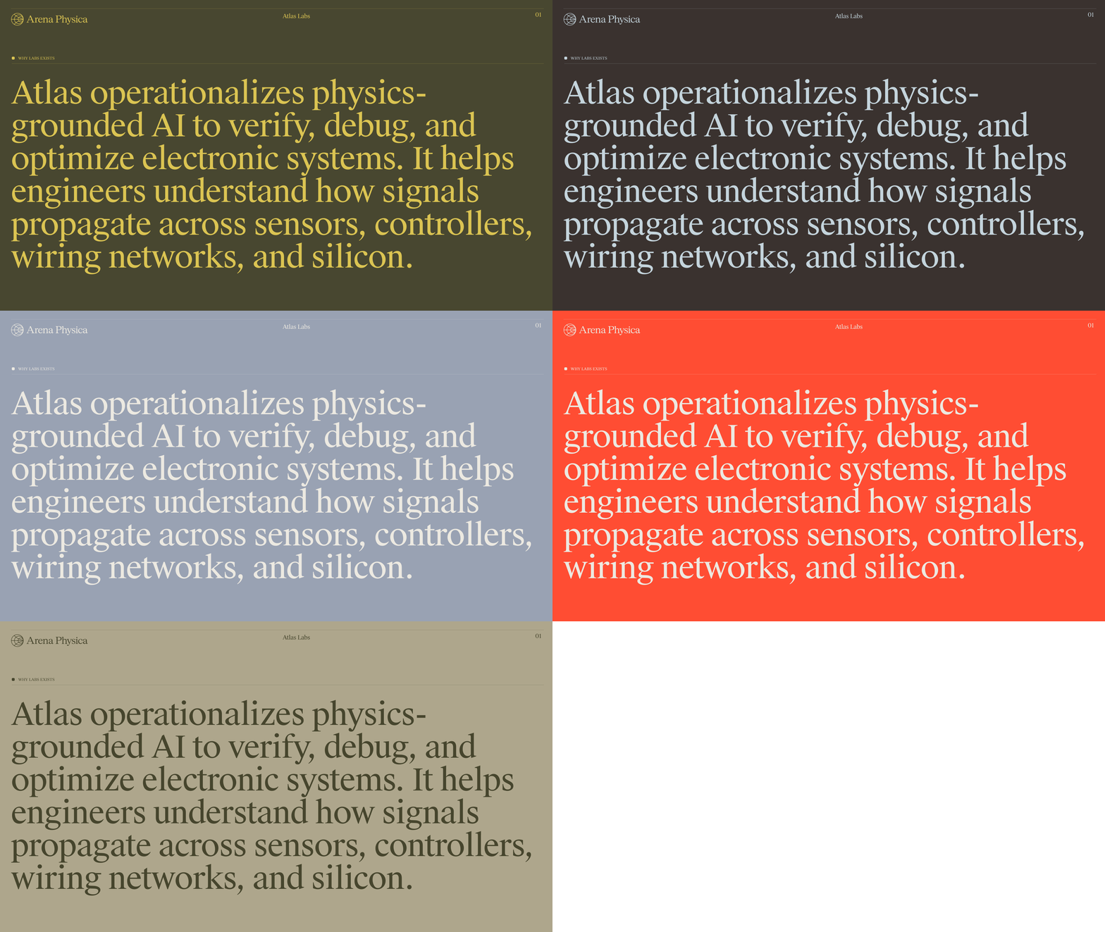
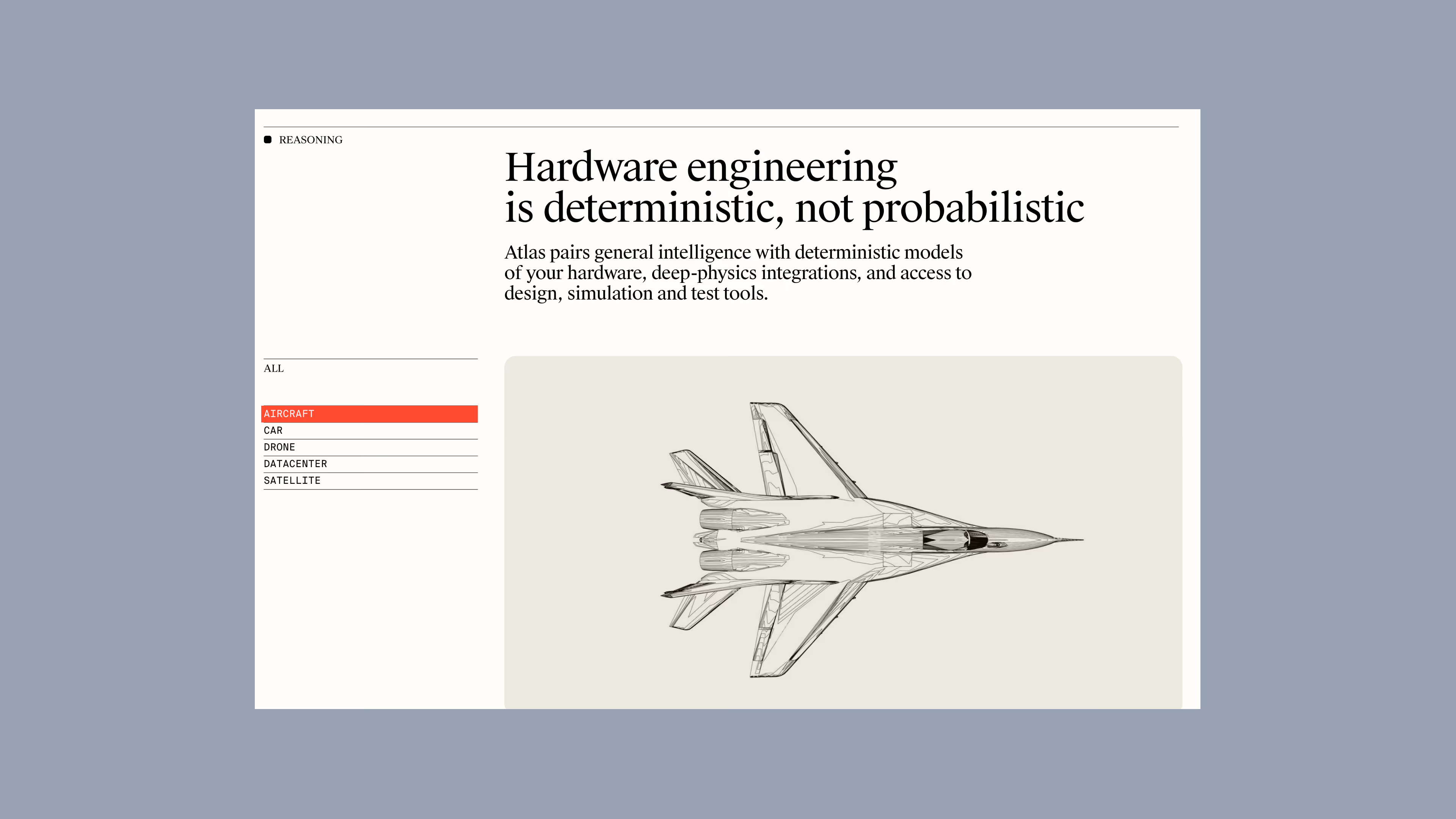
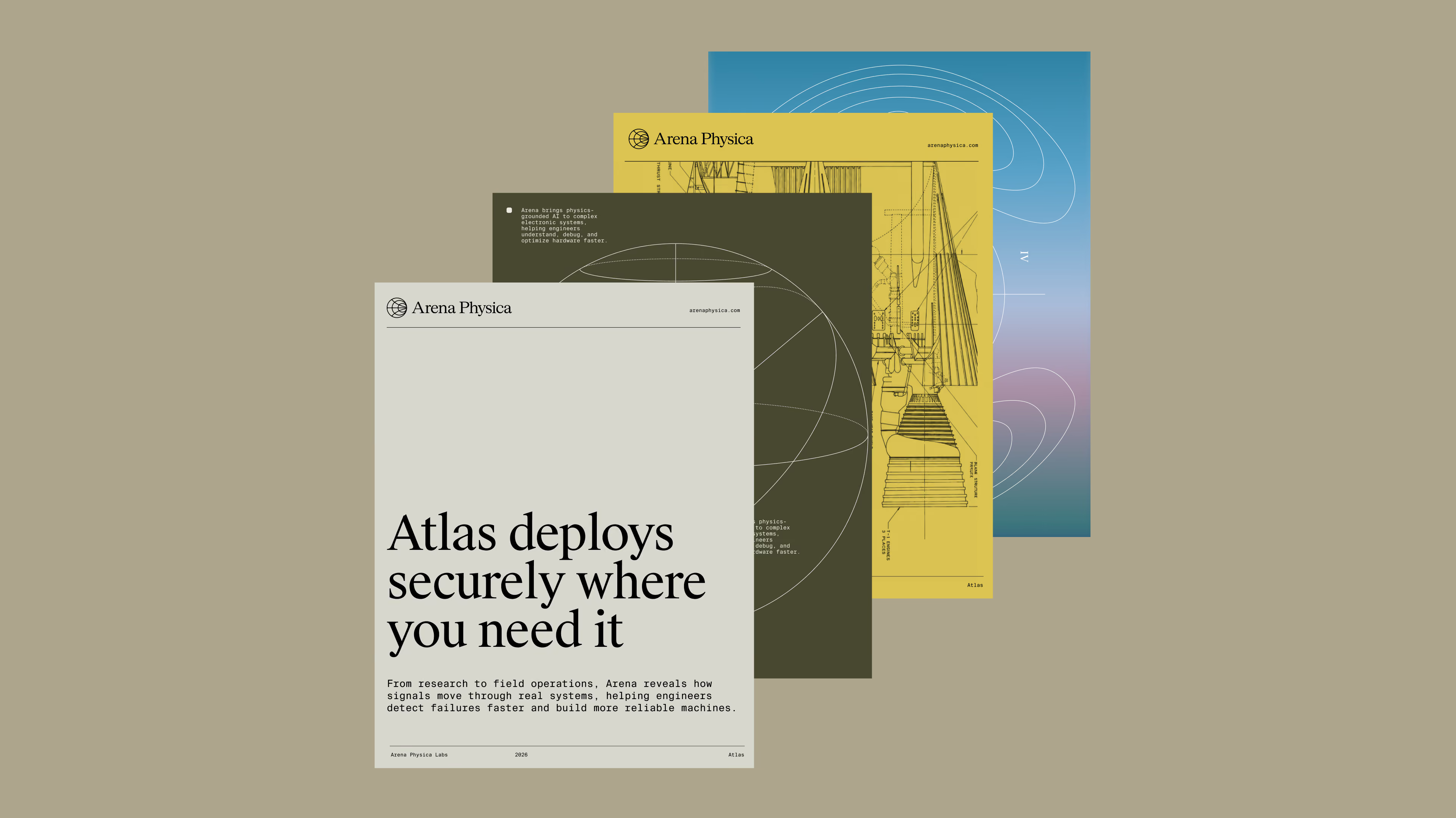
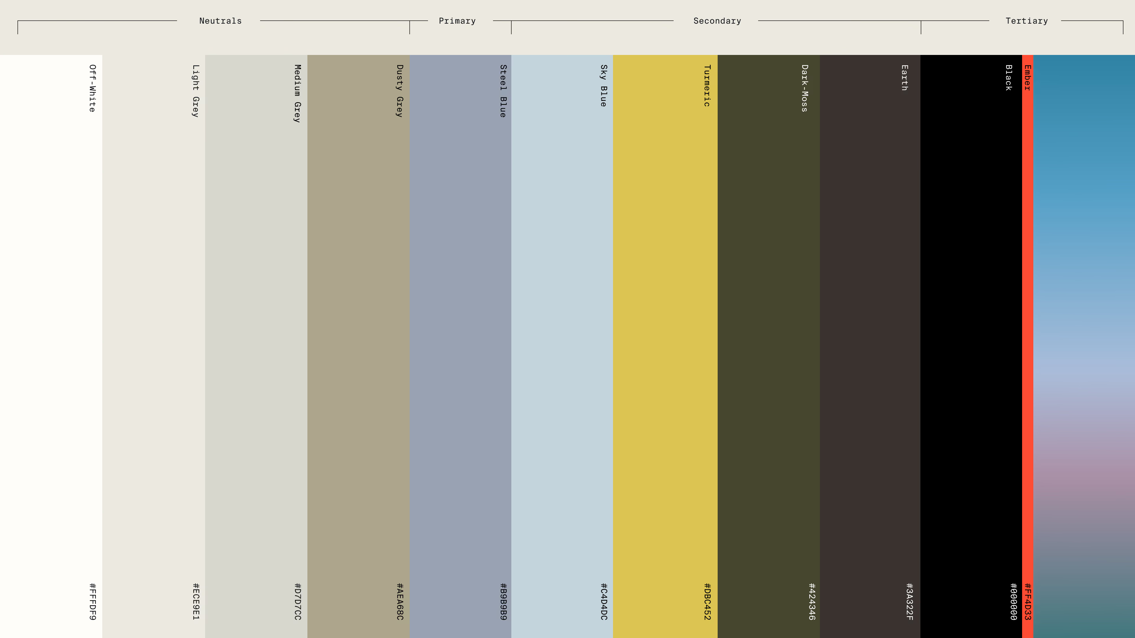
Soft, editorial neutrals create a refined foundation, while a vibrant orange accent brings energy and focus. Suisse Works brings a blend of traditional editorial structure and contemporary digital character, balancing dense information with strong readability. Suisse Mono adds a more utilitarian counterpoint, giving the system a technical edge without making it feel overly rigid.