Structural Support
Pylon brings structure to modern B2B operations, giving companies the systems and support they need to run with stability and scale. Their platform turns scattered workflows into connected formations—strong enough for enterprise, flexible enough for fast-moving teams. Slope partnered with Pylon to create a brand identity and website that reflect this foundation: engineered, reliable, and built around supporting customers at every level. The rebrand launched alongside their Series B announcement, perfectly timed to reflect their evolution from a point solution to a category-defining company.
The visual system is rooted in architectural logic—grids, beams, and structural units that act as a metaphor for how Pylon supports its customers. Every line carries weight, every shape reinforces another, and every formation suggests a network designed to hold things together. It’s a clean, geometric language that feels precise, intentional, and dependable. The result is a brand built like a support structure itself: steady, organized, and always working behind the scenes to keep things standing.
Identity System
Motion
Website Design &
Development
Symbol Construction
The visual system starts with the symbol: a geometric interpretation of a pylon, reduced to its essential forms. Circles, beams, and balanced negative space create a mark that feels engineered—a modern support column distilled into a simple, iconic shape.
Blueprint Logic
The color system for the brand is built on a clean foundation of white, off-black, and a full grey range, creating clarity and consistency across the site. Pylon Blue acts as the primary brand signal, with blueprint tones used to extend emphasis where needed.
Bright accent colors appear sparingly—only to highlight key moments, motion, or focus. The result is a focused, structured palette that feels engineered, consistent, and built for legibility.
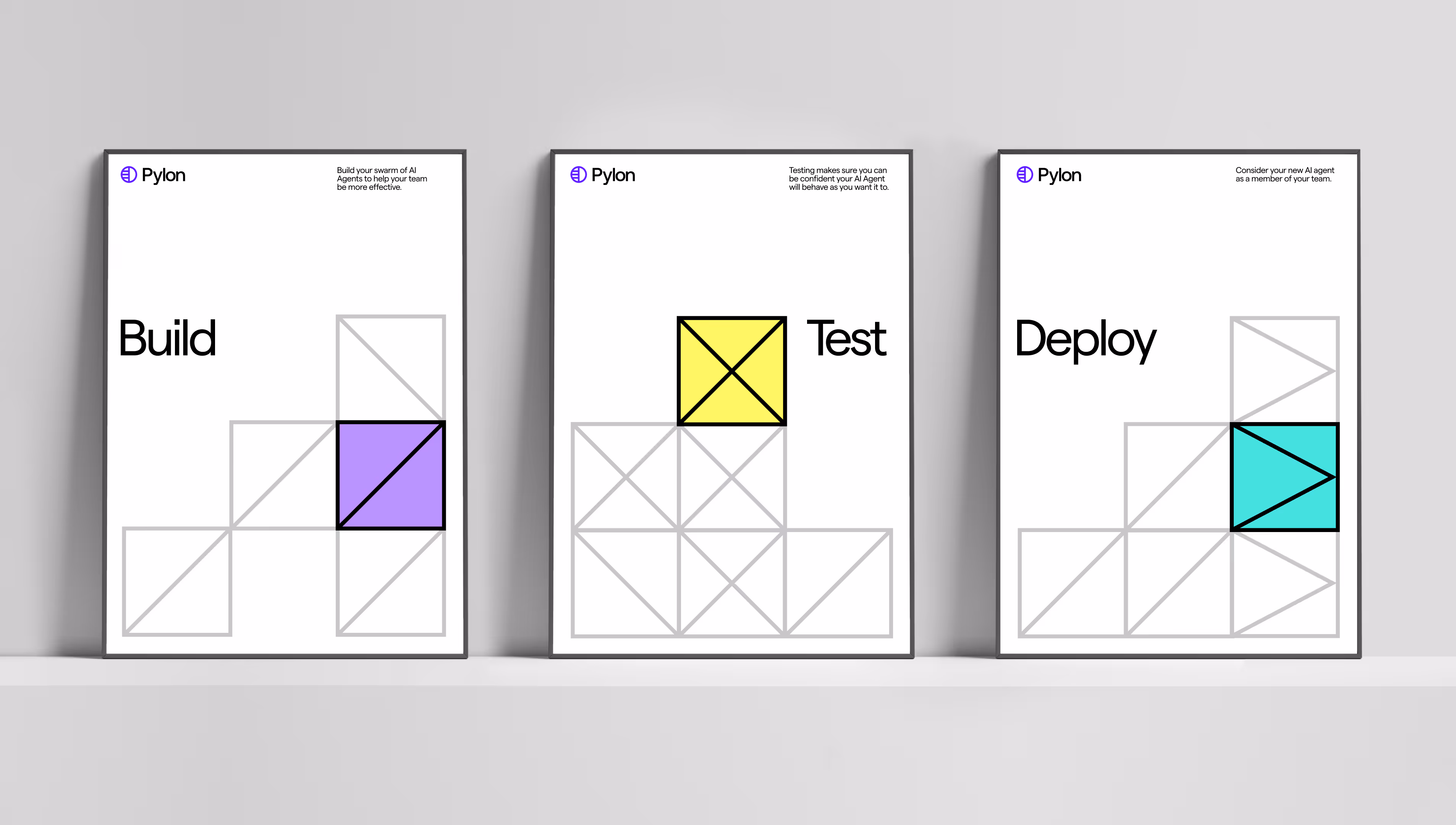
Defining a Cohesive AI System
As Pylon evolved from a single omnichannel support tool into a complete AI-native platform with four distinct product lines - Core Platform, AI Agents, AI Assistants, and Account Intelligence, they needed a visual language that could distinguish between different AI capabilities without creating confusion. We developed a comprehensive iconography system and brand kit that gave each product line its own visual identity while maintaining cohesion across the family. The challenge was particularly acute in the AI space, where abstract concepts like "agents" versus "assistants" needed to be immediately legible to enterprise buyers.
Through careful icon design, color coding, and strategic use of product animations mixed with static imagery, we created a visual framework that scaled across Pylon's expanding product ecosystem. The result was a brand that communicated technical sophistication and enterprise maturity—moving beyond the scrappy startup aesthetic to signal that Pylon had become the definitive platform for B2B support.